Responsive Footer Design using HTML & CSS

Responsive Footer Design using HTML & CSS

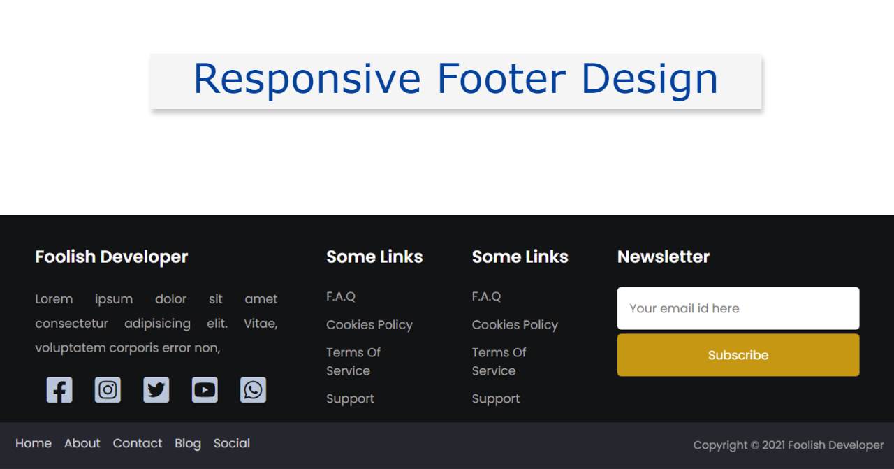
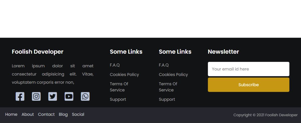
In this article, you will learn how to create a Responsive Footer Design using HTML and CSS. Earlier I shared many more types of HTML footer tutorials with you. Footer is one of the most important parts of any website. The beauty of a website depends a lot on the footer design.

There are many types of Responsive Footer. Some websites use a simple footer that contains some basic information and some links. Some websites use modern footer designs which include many types of information, links, social icons, subscribe forms, etc.

It is made fully responsive so that it can be easily used on any device. CSS's Flexbox has been used to make it responsive. With the help of Flexbox, no separate CSS code had to be added to make it responsive.

Responsive Footer using HTML and CSS

To create this project (simple responsive footer HTML CSS) you need to have a basic idea about HTML and CSS. Below I have shared step-by-step tutorials and provided the necessary source code.

 If you only want the source code, you can use the download button at the bottom of the article.

Step 1: The basic structure of footer design

The basic structure of this footer design has been created using the following HTML and CSS codes. This structure will contain all the information such as text, social icons, links, newsletters, etc.

<footer>
  <div class="row primary">
 
  </div>
</footer>

Background-color light black is used here. Here width: 100% and min-height: 100px are used. Its height will depend on the amount of content. 

body {
  padding: 0;
  margin: 0;
  min-height: 100vh;
  display: flex;
  align-items: flex-end;
}

footer {
  background-color: #121315;
  color: #a7a7a7;
  font-size: 16px;
min-height:100px;
width:100%;
}

footer * {
  font-family: "Poppins", sans-serif;
  box-sizing: border-box;
  border: none;
  outline: none;
}

This footer area is divided into 4 columns using the following CSS codes. We call this column sharing method Flexbox.

.row {
  padding: 1em 1em;
}
.row.primary {
  display: grid;
  grid-template-columns: 2fr 1fr 1fr 2fr;
  align-items: stretch;
}
The basic structure of footer design

Step 2: Add information to Responsive Footer Design

Now I will add all the information like some basic text, social icons, etc. in this footer design.

Add information to the first column

I have added the required information in the first column using the following HTML and CSS codes. Here I first added a heading then some basic text and four social icons.

<div class="column about">
    <h3>Foolish Developer</h3>
    <p>
      Lorem ipsum dolor sit amet consectetur adipisicing elit. Vitae,
      voluptatem corporis error non,
    </p>
                    
    <div class="social">
     <i class="fa-brands fa-facebook-square"></i>
     <i class="fa-brands fa-instagram-square"></i>
     <i class="fa-brands fa-twitter-square"></i>
     <i class="fa-brands fa-youtube-square"></i>
     <i class="fa-brands fa-whatsapp-square"></i>
    </div>
</div>

I have designed all that information using the following CSS codes.

.column {
  width: 100%;
  display: flex;
  flex-direction: column;
  padding: 0 2em;
  min-height: 15em;
}
h3 {
  width: 100%;
  text-align: left;
  color: white;
  font-size: 1.4em;
  white-space: nowrap;
}
.about p {
  text-align: justify;
  line-height: 2;
  margin: 0;
}
div.social {
  display: flex;
  justify-content: space-around;
  font-size: 2.4em;
  flex-direction: row;
  margin-top: 0.5em;
}
.social i {
  color: #bac6d9;
}
Add information to the first column

Add information to the second column

Now I have added the content in the second column using the following HTML and CSS codes. I have used four links in this column.

<div class="column links">
   <h3>Some Links</h3>
   <ul>
      <li><a href="#faq">F.A.Q</a></li>
      <li><a href="#cookies-policy">Cookies Policy</a></li>
      <li><a href="#terms-of-services">Terms Of Service</a></li>
      <li><a href="#support">Support</a></li>
   </ul>
</div>


ul {
  list-style: none;
  display: flex;
  flex-direction: column;
  padding: 0;
  margin: 0;
}
li:not(:first-child) {
  margin-top: 0.8em;
}
ul li a {
  color: #a7a7a7;
  text-decoration: none;
}
ul li a:hover {
  color: #2a8ded;
}

Add information to the second column

Add information to the third column

Now the following codes have helped to design the third column. I have also added some links in this column.

<div class="column links">
   <h3>Some Links</h3>
   <ul>
     <li><a href="#faq">F.A.Q</a></li>
     <li><a href="#cookies-policy">Cookies Policy</a></li>
     <li><a href="#terms-of-services">Terms Of Service</a></li>
     <li><a href="#support">Support</a></li>
   </ul>
</div>
Add information to the third column

Add information in four columns

Now in the fourth column, I have added the newsletter subscription form. Users will be able to subscribe to your website using this form. As a result, the user gets a notification whenever you upload any content.

<div class="column subscribe">
   <h3>Newsletter</h3>
   <div>
      <input type="email" placeholder="Your email id here" />
      <button>Subscribe</button>
   </div>
</div>


input,
button {
  font-size: 1em;
  padding: 1em;
  width: 100%;
  border-radius: 5px;
  margin-bottom: 5px;
}
button {
  background-color: #c7940a;
  color: #ffffff;
}

Add information in four columns

Step 3: Create a copyright section in the footer

Now I have created a copyright section in this footer design. This section includes a copyright link and some footer menus. Using the HTML and CSS codes below, I added 5 menu links and added a copyrighted text.

<div class="row copyright">
   <div class="footer-menu">
      <a href="">Home</a>
      <a href="">About</a>
      <a href="">Contact</a>
      <a href="">Blog</a>
      <a href="">Social</a>
   </div>

  <p>Copyright &copy; 2021 Foolish Developer</p>
</div>


.copyright {
  padding: 0.3em 1em;
  background-color: #25262e;
}
.footer-menu{
  float: left;
    margin-top: 10px;
}

.footer-menu a{
  color: #cfd2d6;
  padding: 6px;

  text-decoration: none;
}
.footer-menu a:hover{
  color: #27bcda;
}


.copyright p {
  font-size: 0.9em;
  text-align: right;
}

Now it's time to make this simple HTML footer fully responsive. It's very easy to make it responsive.

@media screen and (max-width: 850px) {
  .row.primary {
    grid-template-columns: 1fr;
  }

}

Responsive Footer Design

Hopefully, you have learned from the above tutorial how I created this Responsive footer Design using HTML and CSS. Earlier I showed how to create a simple footer design

You can use this link if you want to create a footer using bootstrap. Below is a download button with which you can download the required source code.