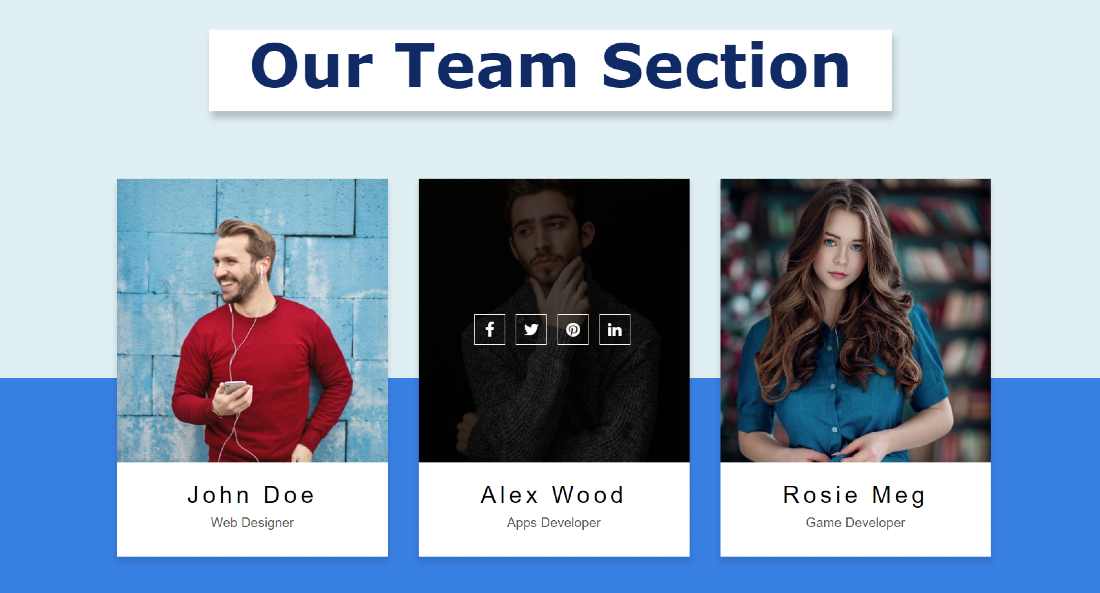
Responsive Our Team Section is used in various business and personal websites. Team Section you can easily create with the help of HTML and CSS code. This will increase the quality of your website as well as attract users. Here you can sort some information including profile images of important people of your company or business.
In this article, I will show you how to Create a responsive team section using HTML, CSS, and Bootstrap. Before that, I made many more types of profile cards and team sections.
Here I have used three profile images you can increase or decrease the amount if you want. I have shared in the tutorial below how to increase this amount. It's a completely responsive team section bootstrap which I used bootstrap programming code to make it responsive. HTML and CSS are mainly used here to design it.
I have used social media icons for each profile image. Under normal circumstances, these icons are completely hidden. These icons appear when you click on the profile box. All in all, it is a beautiful and simple Responsive Our Team Section design.
Responsive Our Team Section
I have used a profile image for each column. I have added names and professions to this image. You can easily add a lot more text or anything else if you want.
The icons are hidden so the icons are clearly visible when you click on the profile card. In this case, when you click on the images, the background color of the image becomes blurred and the image is slightly zoomed.
You can use the demo below to get a live experience of how it works. Here you will find the required source code which you can copy and use in your own work.
See the Pen by Foolish Developer (@fghty) on CodePen.
If you are a beginner then you must follow the tutorial below. Below I have shared with you how to make it in full step by step. In each step, I have shown the possible results so that your understanding is facilitated.
Create the Our Team Section by using HTML & CSS
Here basically I have used two CDN links one Bootstrap and the other foes awesome. Bootstrap helped make this design responsive. The font awesome link helped to make the social icons used here work.
You must paste these links into the head (<head> </head>) section of your HTML file.
Step 1: Create the basic structure
First of all, I will create the basic structure of this design and design the webpage. First I added the basic structure of this team section using HTML code.
Step 2: Make a box in the first column
I made a small box here using the HTML and CSS code below. I have divided this web page into three columns and in each case, a box has been made.
I have used white as the background color of the box and box-shadow so that it can be seen clearly from the webpage.
Step 3: Add a profile image in the box
Now I have added the profile image and arranged it nicely on the whole box. Here I have added the hover effect to the image. I have used transform: scale (1.2) to zoom in on the image when you click on it. Here transition: all 0.4s ease 0s is used which helped to make this zooming work smooth.
Step 4: Add social media icons
Now I have added icons to various social media. Basically, I have used four social icons here. You can make a change of your choice if you want.
Now with the help of CSS code I have designed the add-on icons above. I have used white as the background color of the icons and transform has been used here.
Using Transform, we can see the icons by turning them 180. Then opacity: 0 is used here, which means that the icons cannot be seen under normal conditions. The icons used here are font-size: 20px and height and width 40px. A white border has been used around the icons.
Now I have made these icons visible. As I said before, icons are not usually seen. As you click on the card, the icons appear. I used Optical Zero to make the icons invisible.
Now I have used opacity: 1 using hover. This means that when someone clicks on this slider, the icons will be optical, that is, the icons will be visible.
Step 5: Add basic text to this team section
Now I have added some basic text here using the HTML and CSS code below. Here basically I added names and professions. You can add any other information here if you want.
I used text-align: center to keep the text in the middle. I used padding: 25px to create a space around.
Step 6: Make the second card
Above we have beautifully designed one of the three columns. Similarly here I have made two more columns. I didn't have to add any CSS code separately in this case, I just changed some basic information.
I made the second column using the following HTML codes. I just changed the image here and changed some of the text.
Step 7: Create a third team member section
In the same way, I made the number three card using the following codes. Here too I have changed the image and changed the basic text.
Hopefully, in the above tutorial, I have explained to you how I have created the Responsive Our Team Section using HTML and CSS code. I have already created many more designs using bootstrap code.
That will help you to learn something new. If there is any problem then you can watch the video tutorial above. Below I have given the download link which will help you to download the codes.


