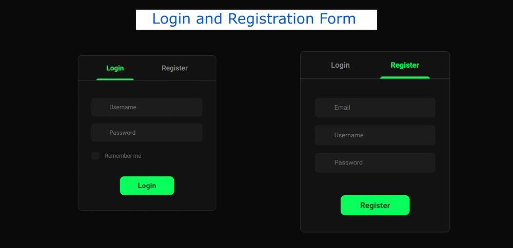
From this article, you will learn how to create a Login and Registration Form using HTML CSS, and JavaScript. The login form is a common element for any website.
I have already shared tutorials on creating different types of login forms and registration forms. But they were different designs. Here I have created those two designs completely together.
We see such registration forms on different websites. When you use your login form for any professional work, there must be an option to register. Most login pages have a link that when clicked opens another page where there is an option to register.
Login and Registration Form in HTML CSS
Here you can log in and register in this element. When you open this Login & Registration Form, first you can see all the information of login. Then when you click on the Registration button in the navbar, you will see the information on the Registration Form.
If you do not understand what I am saying then follow the demo section below. Here I have given a live preview and required source code.
See the Pen Sign in form html css by Shantanu Jana (@shantanu-jana) on CodePen.
As you can see, a box has been created on a black background. First, there are two texts in the box. Those two texts will basically act as select buttons. Under normal circumstances, the first text i.e. login option will be selected.
Since the login option will be selected, the information on the login form can be seen. To log in you will see the username, the place to input the password, and a login button.
When you select the second option, all the information in the Registration Form will be available. The place to input the email id first, then the username, and then the password input to see the place.
How to Create a Login and Registration Form
Now if you want to create this login and registration form in HTML then you have two options. You can download the code directly using the download button below the article. Or below I have shared a step-by-step tutorial.
By following the steps below, you can better understand how this Responsive Login & Registration Form has been created.
The basic structure of registration form
Using the code below, I first created the basic structure of the login and registration form. The basic structure is an area in which we can see all the information.
I have done some basic design of webpage using CSS below. Black color has been used in the background here.
Now the basic area of this login and registration form has been created. Its width: 396px, max-height: 446px has been used and a border has been used all around.
Create a select navigation bar
Now the navigation bar has been created which will have two select buttons.
Now the select option in this navigation bar has been designed. The option that is selected will change color and an underline will be added below.
Login and Registration Form Information
Now all the information on the login and registration form has been added in the following HTML section. I have used the HTML input function to create different input boxes and the button function to create buttons.
Design the input and login button
The input spaces are designed using the following CSS. The size of these input boxes depends on the padding: 16px 18px 16px 51px.
Now the checkbox option has been designed. Here we see a check box containing the login form. I have used the following CSS to design that option.
Now the button between the HTML login and registration form has been designed. Depending on the green color and size padding in the background of the button: 14px 52px.
Activate the Login and Registration form
Now the design of this simple login and registration form is complete. However, the select option here is not implemented now.
In effect, when you click on the registration button, you will see all the information in the registration form and all the information in the login form will be hidden. I did this using a few jQuery.
I hope you have been able to create this login and registration form in HTML using the above code. If there is any problem then you must comment.
In the meantime, I have shared the designs of different types of registration forms and login forms separately. Use the button below for the source code to create this registration form.


