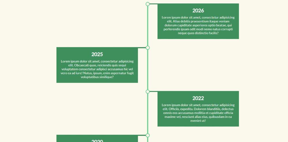
A responsive Vertical Timeline is often used on websites to sort any information in terms of time. In this article, you will learn how to create a Responsive Vertical Timeline using HTML and CSS.
This type of CSS Vertical Timeline is very easy to create. For this, you have to have a basic idea about HTML and CSS. The timeline is one of the most used for various business websites or personal websites. In this case, you can show your own experience or your success journey to the user in the timeline.
Responsive Vertical Timeline
This Vertical Timeline has been created in a very simple way. I have shared a preview below. That demo will help you figure out how it works.
See the Pen Untitled by Foolish Developer (@foolishdevweb) on CodePen.
I didn't use any JQuery, BoostApp, or JavaScript. Responsive Vertical Timeline has been created using Pure HTML CSS. I have added all the information using HTML. Then I designed and made it responsive using CSS.
How to create a vertical timeline in HTML
I have not shared any tutorial here. Because it is very simple so no tutorial is needed. Here you will find the required source code which you can copy directly. Although I have been given an option to download the source code.
As you can see, this is a simple timeline. There is a long line here. The information is shown in small boxes on both sides of the line. First, create an HTML CSS file. Then add the following code to that file.
The code below is the HTML code that will basically add all the text in this Vertical Timeline. Add these codes to your HTML file.
Now is the time to design and make Responsive Vertical Timeline Responsive. Copy the codes and add them to your CSS file. You must rename your CSS file using style.css.
Hopefully, you have no problem creating this Responsive Vertical Timeline using the codes above. If you do not have any technical knowledge then use the download button below. If there is any difficulty in creating CSS Vertical Timeline, please comment.


