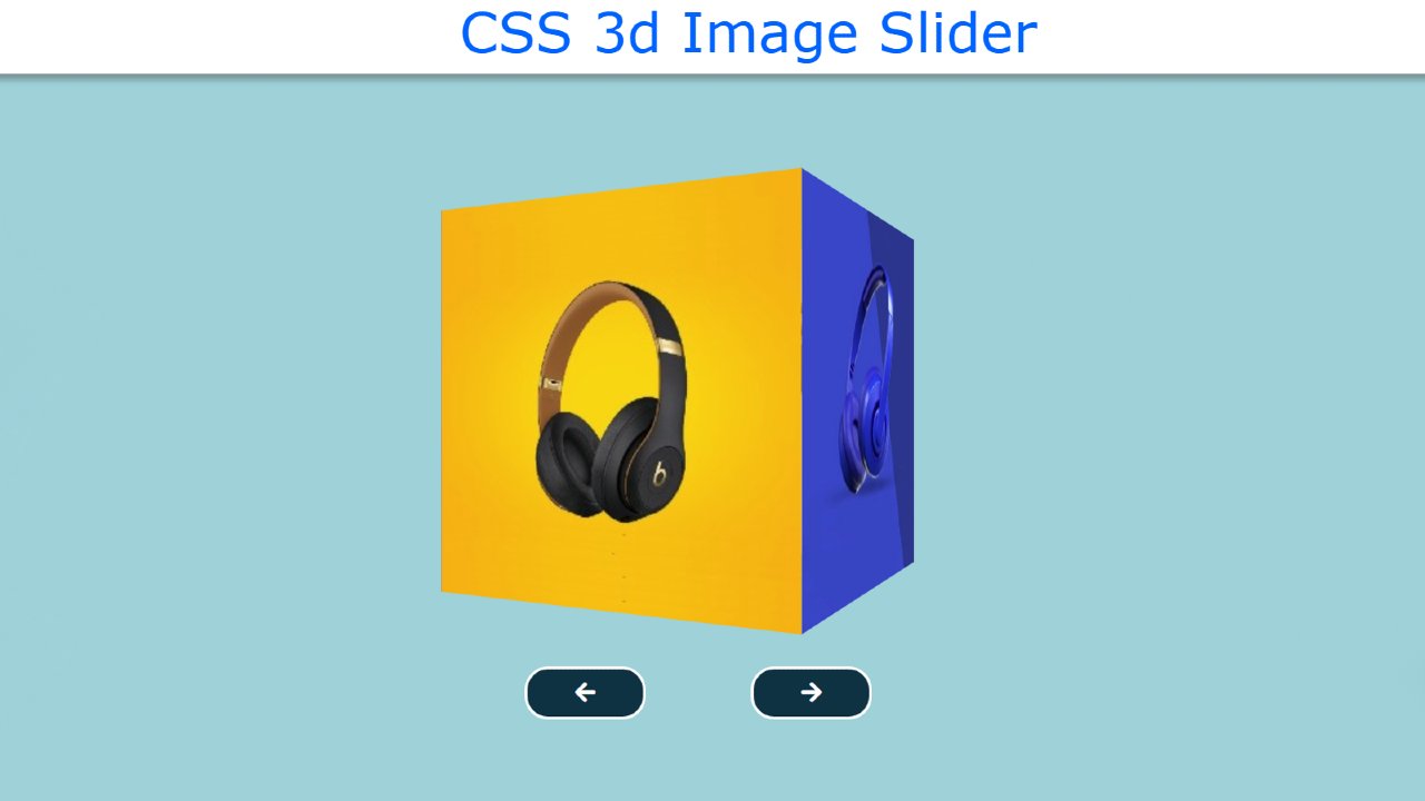
Do you want to make 3d Image Slider? Then follow this 3D Image Slider Design using HTML and CSS.
You must have seen slideshows in many places on many websites. Which enhances the structure and quality of the site. Earlier I made different types of image slideshows and sliders. Some designs can change the image automatically. In some cases, the manual image has to be changed. I have made this design a little more modern. It is basically a cube 3D image slider in HTML. Here we have added four images to the four sides of the cube.
3d Image Slider using HTML CSS and JavaScript
In this tutorial below you will learn how to create a 3D Cube Image Slider. There are two navigation buttons to change the images in this design. If you know basic HTML and CSS then you can easily create this project. Here I have designed it using HTML and CSS and implemented the image change with the help of JavaScript.
First I created a box using HTML and CSS. Then I added four images on each side. Also made two navigation buttons here. Using JavaScript's click function at the end of it all, I have arranged to rotate this up to a 360-degree angle. When you click on that navigation button, the cube slider will rotate 90 along the y-axis.
See the Pen 3D Cube Slider by Foolish Developer (@fghty) on CodePen.
Hopefully, the live demo above has helped you. Above you will get the required source code. Also below the article, you will find the complete source code in this download button.
Step 1: Basic structure of image slider
This has created the basic structure of the 3D image slider using the following HTML and CSS code. Here I have used the background color of the web page light blue and the width and height of the cube: 300px.
Step 2: Add images to the slider
Now using the following HTML code I have added the required images in this slider. Here we have basically used four images for the four sides of the cube. I have made the images equal to the size of a cube. I have arranged the four images used here at a 90-degree angle with each other to form a cube.
Step 3: Create two buttons to change the image
Now it's time to create two buttons. These buttons will help to change the image. I have used one icon for each of the two buttons and I have used font-size: 20px to increase the size of the icon. Border-radius: 20px is used to make the button slightly round.
Step 4: Activate the 3d Image Slider using JavaScript
Above we have designed this perfect. Now is the time to implement the 3D Cube Image Slider with the help of JavaScript. First I set one of the three ID functions to be constant. Here is a constant of cube and navigation buttons.
Then we have set the position 0 here, which means that under normal conditions this slider will be at zero degrees angle.
Now I have executed the Next button using JavaScript below. When you click on the Next button, the cube will rotate 90 degrees. I used transform = rotateY to do this rotation. Which helps to rotate something along the y-axis. This causes it to rotate 90 degrees along the y-axis whenever you click on the Next button. As a result, we get to see the second image.
Now using these codes I have implemented the previous button. When you click on the Previs button, the slider moves back to 90 degrees.
Now use the 3d cube image slider in HTML to change the fully created image. Hope you know how I designed this 3d image slider using HTML and CSS. If there is any problem, you can let me know by commenting directly on my Instagram.


