In this article, you will learn how to create Skeleton Screen Loading Animation using HTML CSS, and JavaScript. It is a modern design used for loading anything.
Basically, when loading any element of different types of websites, you will notice a kind of animation which is known as Skeleton Loading or splash screens.
For example, in the case of YouTube, when the internet is slow, the background is gray and a shadow loading can be seen. This type of Skeleton Screen Loading Design undoubtedly enhances user satisfaction and webpage quality.
Skeleton Screen Loading Animation using HTML & CSS
I have also seen you how to implement skeleton loading design with CSS. I used HTML CSS to make it. With the help of JavaScript to make it work. Below I have given a live demo that will help you understand how it works.
See the Pen Skeleton Screen Loading Animation by Foolish Developer (@fghty) on CodePen.
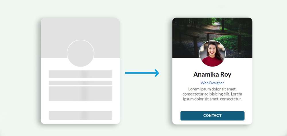
Hopefully, the demo above has helped you. If you are a beginner then you must follow the tutorial below. First I made a profile card and added a skeleton loading design to it.
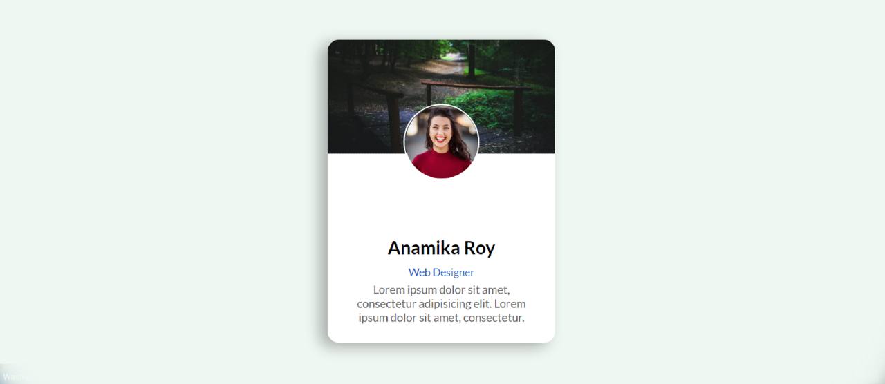
This loading animation will continue for 3 seconds when you open this web page. After three seconds all the elements of the profile card can be seen. You can increase or decrease the time in animation if you want.
Step 1: Design the web page
I designed the webpage using the CSS codes below. Here the background color of the webpage is light blue and the height is 100vh. align-items: center helped keep all items in the middle of the webpage.
Step 2: Basic structure of Skeleton Screen Loading
Now we have created the basic structure of skeleton loading design using the following HTML and CSS code. I used profile card height: 400px and width: 300px. I used white as the background color and used a border-radius to make it slightly rounded.
Step 3: Add profile image and cover image
Now I have added profile image and cover image to this profile card. I added the profile image to it using HTML code. Then using CSS I designed that profile image and added a cover image. Cover image height: 150px and width: 100%.
I have used the profile image width and height 100px and border-radius: 50% has been used to make the image completely round.
Step 4: Add basic text to the Skeleton Animation
I have just added some information to the profile card. Then those basic texts have been designed with the help of CSS.
Step 5: Create a contact button
I made a contact button at the bottom of the card. I have used small button height: 35px, width: 80% and background color blue. Font-weight: bold has been used to increase the size of texts.
Step 6: Add Skeleton Screen Loading to images
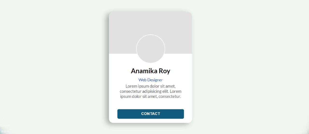
Now I have added Skeleton Screen Loading Animation between profile image and cover image. Although the animation is no longer functional, gray color has been added to the background.
Step 7: Add CSS Skeleton Loading Animation to the text
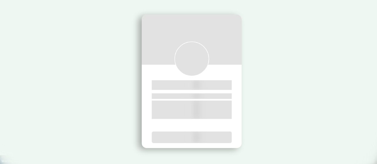
Now I have added skeleton loading CSS between basic description and text. Above I added basic text and description using CSS and HTML code. Now I have added Skeleton Screen Loading Animation to those texts and descriptions.
I used @keyframes to make the animation work at the end of it all. The animation here means a shadow will continue to move from left to right. It will take a total of 2 seconds to move from left to right.
Step 8: Use JavaScript to turn off Skeleton Loading Design
Now is the time to implement this animation using JavaScript. Above we have added to this animation profile card using HTML and CSS. Now I need to turn off the animation after a certain time with the help of JavaScript.
If you know basic JavaScript you can easily understand it. I have used 3000 milliseconds or 3 seconds here. This means that after 3 seconds this animation will be closed and the elements of the card can be seen.
Hopefully from this tutorial, you have learned how to create Skeleton Screen Loading Animation using HTML and CSS. I have already shared many more such tutorials. You can share it with your friends if you like this design. If you have any problems you can ask me directly on Instagram(@foolishdeveloper).


